

|

photo manipulation & text by nacrowe
RENOWNED artist MAX GIMBLETT is an INTRIGUING NEW YORK CITY transplant from NEW ZEALAND who relies on INSTINCT and GESTURAL TECHNIQUE to create his highly EVOCATIVE, MINIMALIST, ABSTRACT PAINTINGS. influenced by TRADITIONAL JAPANESE CALLIGRAPHY and ZEN BUDDHIST PRECEPTS, his work and more importantly his CREATIVE PROCESS is the result of BEING PRESENT in the CURRENT MOMENT and not being influenced by CONSCIOUS THOUGHT. COMPOSITIONS are not random, but instead just arise from the ether onto the canvas as he quickly grunts and GESTURES his way through his PROCESS.
from a WESTERN PERSPECTIVE it all appears a bit PERFORMATIVE and CONTRIVED, but given FOUNDATIONAL BUDDHIST CONCEPTS of NON-SELF and NON-ATTACHMENT, this EARNEST attempt at diminishing the role of the CONSCIOUS MIND in the PROCESS OF CREATION is WELL-GROUNDED. the INTELLECT is something that humans trip over all the time, searching and positing meaning where none exists. this is especially the case with ART and the critical appreciation of such. with GIMBLETT his ART has no INTERNAL agenda or HIDDEN meaning, it just EXISTS. its PROCESS of BEING was IMMEDIATE and its COMPOSITION the result of INSTINCTUAL, PRECONSCIOUS GESTURE yet its end result feels PERMANENT and SOLID. its quite the contradiction. similar to that of MARK ROTHKO or FRANZ KLINE, his is art that is also meant to be experienced in person. both known for his TRADITIONAL sumi ink PAINTINGS and MULTI-COLORED MANDALAS as well as MULTI-LAYERED PALIMPSESTS on various canvas shapes, INTERNATIONAL recognition for GIMBLETT's work came after being part of an exhibit on the MODERN influence of ASIAN ART on AMERICAN ART at the GUGGENHEIM in 2009. i found this BRIEF documentary, MAX GIMBLETT: ORIGINAL MIND (SPIRIT BOX, 2017), to be pretty REFRESHING as GIMBLETT's CREATIVE PROCESS makes sense on its own terms, yet confronts and undercuts that of the much considered and often OVERLY-INTELLECTUALIZED WESTERN TRADITION we are all indoctrinated under. his WORK and PROCESS seems to harken back to a PURER STATE OF BEING where one just reacted IN-THE-MOMENT and created with UNADULTERATED INTENTION with no PRECONCIEVED GOAL or OUTCOME outside of TRUE EXPRESSION. it makes me consider the similar INSTINCTUAL PROCESSES of ORNETTE COLEMAN and JACK KEROUAC who just went for it sans GUIDING PRINCIPLES or clear COMPOSITIONAL ELEMENTS. ART just emerged. definitely a COMPELLING conversation.
0 Comments

section of Nuestra Señora de las Iguanas (Our Lady of the Iguanas) [Mexico, 1979] by GRACIELA ITURBIDE
ive had the PRIVILEGED opportunity most of my life to be in circumstances that allowed me to experience UNIQUE CULTURES and witness RITUALS, PERSPECTIVES, HISTORIES, UNDERSTANDINGS and CUISINES ALIEN to my own. i consider it one of the great blessings of my life and for much of it i had a camera. when i was an INTERNATIONAL teacher often tasked with providing an elective, PHOTOGRAPHY was often at the top of my list followed by journalism. in both instances i really enjoyed introducing my secondary STUDENTS to NOTABLE PHOTOGRAPHERS from around the WORLD and the VISIONS they introduced. lately ive been revisiting the work of RENOWNED MEXICAN PHOTOGRAPHERS GRACIELA ITURBIDE and her often POETIC yet unblinkingly RAW DEPICTIONS of her NATIVE HOMELAND and its DIVERSE INHABITANTS. there is a DISTINCT SENSITIVITY to her ARTISTIC AESTHETIC which often showcases the hardships of the daily lives of the DISPOSSESSED and the UNDERSERVED with a sense of COMPASSION and EMPATHY. for these PEOPLE ILLNESS, HUNGER, POVERTY, FATIGUE and DEATH are COMMON companions and their PORTRAITS reveal such INTIMACY in a DIRECT MANNER. when i look at ITURBIDE's PHOTOGRAPHS, especially those of REGULAR PEOPLE in UNASSUMING locales where they live, i recognize and access memories of PAST PEOPLE i met along the way who likewise lead DIFFICULT lives in seemingly insurmountably IMPOSSIBLE circumstances. whether that be support STAFF at my former school in RURAL EASTERN VENEZUELA as the country was being decimated by hyperinflation or my FORMER LANDLORD in the COLD HINTERLANDS of NORTHERN ALBANIA, a POLICEMAN with an ADMIRABLE code of ethics in a CORRUPT region with anything but. in ITURBIDE's PHOTOGRAPHS i see a certain HUMBLE DIGNITY that can only arise from those whose FORGOTTEN, UNDERVALUED existences are lived and experienced at the edge of GLOBAL SOCIETY and at the BOTTOM END OF MATERIAL SUPPLY CHAINS. i just find myself becoming transfixed and fascinated anew with who these PEOPLE are and how they go about their daily lives with opportunities and HARDSHIPS so DIFFERENT than my own. to me that portal through the VEHICLE of PHOTOGRAPHY is the very essence of the MAGIC of that MEDIUM. and that was what i tried to instill in my FORMER STUDENTS. an APPRECIATION for PERSPECTIVE outside of my own and that of my CULTURE. its a process and a road i have been traveling down ever since. 
photo manipulation & text by nacrowe
ive long been fascinated by SKATEBOARDS on an AESTHETIC level. just the look, feel and sheer diversity of the GRAPHICS and the COMMUNITIES they REPRESENT and SERVICE. now that i am in BUSINESS SCHOOL ive also taken in an interest in the form just on purely MARKETING level, in which companies are basically manufacturing and selling a PRODUCT that is easily substituted in terms of FUNCTIONALITY but differentiate such based on ARTWORK.
CREATURE SKATEBOARDS is a product line of NHS, INC., a CALIFORNIA-based company that DEVELOPS, MANUFACTURES, MARKETS and DISTRIBUTES several lines related to ACTION SPORTS (i.e. SKATEBOARDING, SNOWBOARDING and MOUNTAIN BIKING) including the ICONIC sibling BRAND SANTA CRUZ SKATEBOARDS. what differentiates the BRANDS from each other is largely the MARKETING and the ARTWORK, as the PRODUCTS themselves are virtually IDENTICAL in terms of SPEC and FUNCTIONAL UTILITY. SANTA CRUZ is consciously geared more towards a MARKET SEGMENT that appreciates the LAIDBACK, SUNNY CALIFORNIA lifestyle with the CLASSIC GRAPHICS by the likes of the draftsman-trained and wildly IMAGINATIVE JIM PHILLIPS leading the way. CREATURE on the other hand is more geared towards the HESHER CROWD with GNARLY and VIVID DEPICTIONS of all things GORY, HORROR-BASED, DEBAUCHED, GOTHIC and UNSEEMLY by a whole host of ARTISTS over the years. in their ongoing YOUTUBE series CREATURE PRESENTS, CREATURE goes behind-the-scenes regarding their ARTISTS who double in real-life as GRAPHIC DESIGNERS, PAINTERS, TATTOO ARTISTS and COMIC BOOK ILLUSTRATORS. past episodes have focused on the CREATIVE WORK of JAY HOWELL, BEN VENOM, MAX SHERMAN, FLORIAN BERTMER, DYLAN GOLDBERGER, GEORGE CAMPIS, HENRY LEWIS, SPACE BAT KILLER and JOHNNY MATEU. the variety of CREATIVE PROCESSES and INSPIRATION is quite STUNNING with each ARTIST taking the overall AESTHETIC of the BRAND in vastly different directions. and yet it all feels COHESIVE from a MARKETING PERSPECTIVE in that you can immediately identify a CREATURE SKATEBOARD on a wall despite the diversity of subjects on display. that sort of BRAND MANAGEMENT is something i think about in school constantly and NHS is one of those companies that come to mind who have been able to do such with seeming COMMERCIAL and ARTISTIC SUCCESS. 
photo manipulation & text by nacrowe
there has been much debate and discussion regarding the role of ART during WORLD WAR II, when the NAZIS effectively raided PUBLIC and PRIVATE COLLECTIONS throughout EUROPE in a multi-pronged bid to both fund its MILITARY MIGHT as well as propagandize their WRETCHED IDEOLOGY on a global stage. it was both an ends and a means unto itself as extolled at length in the HITLER VS PICASSO AND OTHERS: THE NAZI OBSESSION FOR ART (TRAFALGAR RELEASING, 2018) documentary about the NOTORIOUS mass looting of EUROPEAN culture and its AFTERMATH that continues UNABATED on down to the present.
one issue brought up is the idea of PROVENANCE and how MODERN nation states (such as MODERN GERMANY) indefinitely withhold STOLEN ITEMS as articles of the state via RULES and REGULATIONS asking for verified information IMPOSSIBLE to prove for those surviving members of the HOLOCAUST and their DESCENDANTS. it is a black eye that points at a deeper ENTANGLED COMPLICITY in the theft of the past included in CONTEMPORARY, PROMINENT COLLECTIONS. similarly, DUPLICITOUS ART DEALERS that collaborated and worked on behalf of the NAZIS more or less continued UNABATED after the war. their common excuse that BUSINESS IS BUSINESS. the film makes the EXPLICIT point that the REAL DANGER and CORRUPTION of a TOTALITARIAN STATE is not the capacity to directly inflict HARM or PHYSICAL SUFFERING, but instead to convince everyday people to act COMPLICIT on their behalf and alter behavior in accordance to their DIRECTIVES. it is the CORRUPTION and DEBASEMENT of that go-between section of CIVIL SOCIETY that they derive their REAL POWER from. although not mentioned, the context of this film being created in the aftermath of the rise of TRUMP makes that point regarding CIVIL SOCIETY all too REAL in a CONTEMPORARY context. that DEFILEMENT is happening stateside in right now and the coming year will only make apparent which way the AMERICAN public will be swayed. but dividing the CULTURE by utilizing ART through virtue signaling regarding what constitutes PROPER ARCHITECTURE and MUSIC has already begun. we are all boiling frogs in this sense. hopefully it will be stopped at the election box this coming november. we shall see. RESTITUTION has been slow forthcoming for the DESCENDANTS of former GERMAN ART COLLECTORS of JEWISH descent. it is an ongoing process that feels INTRACTABLE but such is the nature of progress. earlier this year with my father i viewed the ADELE BLOCH-BAUER I (1907) painting by GUSTAV KLIMT at the NEUE GALERIE in NEW YORK CITY almost 20 years after i first saw it with him in VIENNA at the BELVEDERE MUSEUM. it took much LITIGATION and even a SUPREME COURT case, but it was returned and later sold to ESTEE LAUDER's husband who put it again on display. one can only hope for such an ending to other pieces of STOLEN NAZI ART worldwide. HITLER VERSUS PICASSO AND OTHERS is a RIVETING film much worth checking out since it EFFECTIVELY elucidates our own COLLECTIVE INABILITY and OUTRIGHT FAILURE to come to complete RESOLVED terms with the full IMPLICATIONS of the NAZI RAPE of EUROPA some 80 years ago. 

photo & text by nacrowe
both volumes of the much REVERED graphic novel PERSEPOLIS (PANTHEON, 2000-2003) by FRANCO-IRANIAN cartoonist MARJANE SATRAPI are a masterclass in NARRATIVE STORYTELLING and the INTERPLAYING POWER of ILLUSTRATIONS to further an AUTHORIAL PERSPECTIVE. of course i am completely biased as i have taught the first volume on more than one occasion during my former teaching career, once to freshman at BROOKLYN TECHNICAL HIGH SCHOOL as a student teacher and then later to my eighth graders at a private international school in EASTERN VENEZUELA. the fact that its subject matter faces head-on the STRUGGLE for IDENTITY and AGENCY in that of developing YOUNG WOMAN in IRAN during the ISLAMIC REVOLUTION in the late 1970s didnt deter my students in both countries from being totally engrossed by the story and the PARALLELS in their lives as YOUNG PEOPLE. you never really know what KIDS will respond to and PERSEPOLIS was a consistent hit.
in both environments, BROOKLYN and RURAL VENEZUELA, i had students that were intimately familiar with the IMMIGRANT EXPERIENCE and the inner TURMOIL that comes when your country's POLITICAL ORDER / ECONOMY / SOCIAL CONTRACT shifts dramatically beneath your feet. at BROOKLYN TECH many students were either the SONS and DAUGHTERS of IMMIGRANTS or immigrants themselves, which my VENEZUELAN students were acutely aware that the then-IMPLODING economy of their HOMELAND was going to alter everything about their lives in relative short order. most of them now are living permanently abroad in GERMANY, ARGENTINA, PANAMA, CHILE or the UNITED STATES (i.e. FLORIDA) as EFFECTIVE REFUGEES. as i mentioned before, the EXTENDED graphic novel PERSEPOLIS is all about a YOUNG WOMAN 's journey into ADOLESCENCE and later ADULTHOOD while dealing with the extensive PERSONAL and SOCIETAL TRAUMA that was the IRANIAN ISLAMIC REVOLUTION. the privileged EGALITARIAN and COMMUNAL order of her youth virtually overnight shifted into something of a REAL-LIFE ORWELLIAN fever dream with MASSIVE restrictions on her SPEECH, APPEARANCE and BASIC FREEDOMS. more than than that the TIGHT-KNIT, mutually SUPPORTIVE COMMUNITY of which she was raised under and which her FAMILY enjoyed for GENERATIONS turn in on itself, with PEOPLE unsure of who or what action would leave them VULNERABLE before the state. people escaped. people disappeared. everything changed including SATRAPI and he relationship with herself. in the second volume she is older, living in VIENNA as a REFUGEE and making her way through the FRENCH education system and again, dealing with the aftermath of her CHILDHOOD TRAUMA and its LONG-TERM CONSEQUENCES on her sense of IDENTITY as a YOUNG WOMAN of PERSIAN descent. the message is sent that even those that survive TRAUMA are somewhat still TRAPPED by such thereafter. even going back and visiting IRAN years later is an act of REVERSE CULTURE SHOCK and immense PERSONAL STRUGGLE due to the delta of what once was to what now has been undoubtedly IRREPARABLY LOST. you are with the idea that our sense of AGENCY and IDENTITY are intertwined with MEMORY and the PERSONAL HISTORY and EVOLVING NARRATIVE we tell OURSELVES about OURSELVES. i think that for KIDS who are the brink of adjusting into YOUNG ADULTHOOD, that message is a CONSEQUENTIAL and SELF-EMPOWERING one. that you are part of a COMMUNITY, but that in the end YOU DEFINE YOURSELF. you write your own NARRATIVE by the LIFE DECISIONS you make. that even severely TRAUMATIC events can be overcome with EMPATHY and LOVE, especially with regards to one's self. i adore both volumes of PERSEPOLIS and consider them ESSENTIAL graphic novels that should be read by everyone. also the film aint half bad either. 
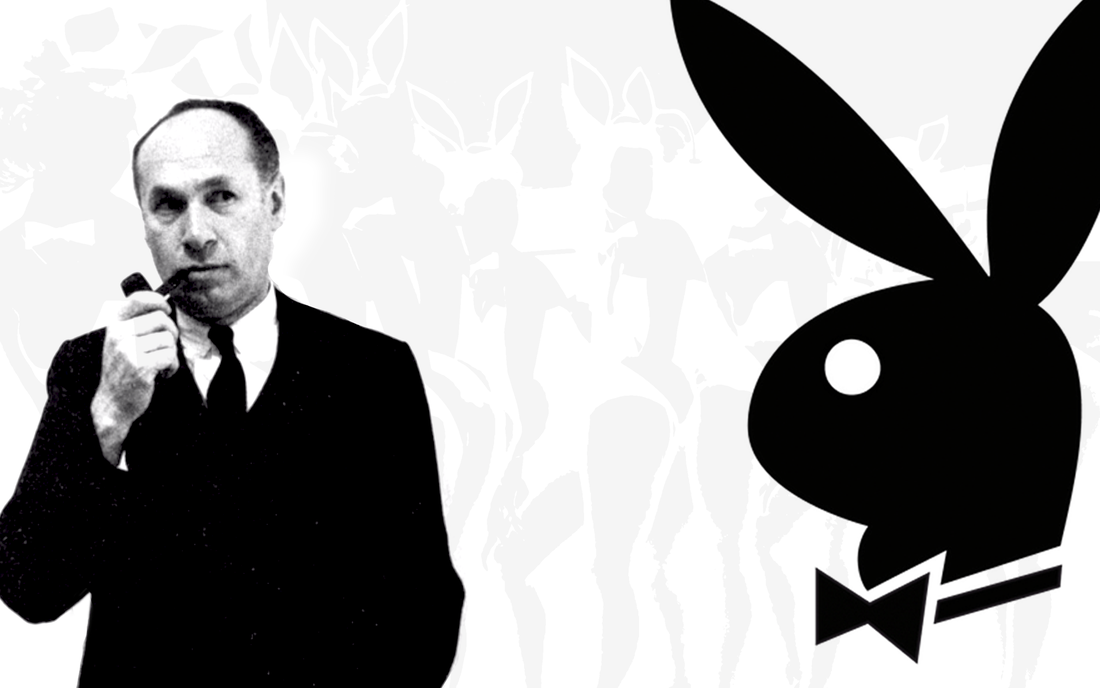
photo manipulation & text by nacrowe
these days in our MODERN DIGITAL ECONOMY we are absolutely bombarded with SLEEK, OMNIPRESENT MULTI-MEDIUM ADVERTISING CAMPAIGNS that are positively INESCAPABLE and the concept of "CORPORATE BRANDING" is so UBIQUITOUS that it now applies to our individual selves and what we project on SEARCHABLE SOCIAL MEDIA FEEDS, BLOGS and CAREER WEBSITES. but back in immediate postwar AMERICA when the HEGEMONIC POLITICAL INFLUENCE and ECONOMIC POWER arguably took off, this concept regarding EFFECTIVE BRANDING was more NEBULOUS and UNDEFINED in the MARKETPLACE. in a sense, that is what makes ART PAUL, the FAMED initial art director of PLAYBOY, such a REVOLUTIONARY figure since he corralled GRAPHIC DESIGN, TYPOGRAPHY, PAINTING and ILLUSTRATION into a CORPORATE LIFESTYLE BRAND that blurred the line between COMMERCIAL and FINE ART. that is before mentioning that his LOGO for PLAYBOY and its MINIMALIST BAUHAUS-inspired AESTHETIC is arguably the most INFLUENTIAL CORPORATE BRANDING of all-time, directly inspiring that of NIKE, MCDONALD'S, AUDI, SPOTIFY, UBER, TARGET, VOLKSWAGEN, FACEBOOK, MASTERCARD, TWITTER, AIRBNB, PEPSI, LOUIS VUITTON, STARBUCKS, NASA, ADIDAS and so on.
the recent documentary ART PAUL OF PLAYBOY: THE MAN BEHIND THE BUNNY (AMERICAN DREAM, 2020) very much gets into the origins and career of PAUL as well as CONTEMPORARY pushback regarding his legacy promoting a company that effectively exploited FEMALE SEXUALITY as another CONSUMERIST COMMODITY. as aforementioned, PAUL was a student of the BAUHAUS and attended the SCHOOL OF THE ART INSTITUTE OF CHICAGO as well as the INSTITUTE OF DESIGN (founded as THE NEW BAUHAUS but today is part of the ILLINOIS INSTITUTE OF TECHNOLOGY) under LAZSLO MOHOLY-NAGY. for MOHOLY-NAGY, design principles were both EXPERIMENTAL and rigorously UTILITARIAN, with the key objective being the AESTHETIC elevation of COMMON household, MASS-PRODUCED objects to in turn promote the well-being of society. its INTRIGUING to consider how DESIGN was viewed in this manner as an OPTIMISTIC EXPRESSION of the new AMERICAN century of dominance and cultural superiority along UTILITARIAN and AESTHETIC grounds. such was how PAUL viewed GRAPHIC DESIGN when he took his meeting with HUGH HEFNER early in his career and effectively created the LOOK of one of the LANDMARK PUBLICATIONS in MODERN AMERICAN history. dont believe me? under PAUL's supervision the MAGAZINE promoted and included the WORK of REVERED CONTRIBUTING ARTISTS such as FRANK GALLO, LEROY NEIMAN, BRAD HOLLAND, KINUKO Y CRAFT, ROY SCHNACKENBERG and BOB LOSTUTTER as well as NOTABLE local CHICAGO ARTISTS such as ED PASCHKE, ROGER BROWN, KARL WIRSUM, SEYMOUR ROSOFSKY and SHEL SILVERSTEIN. likewise CELEBRATED CONTRIBUTING WRITERS included the likes of JOYCE CAROL OATES, JACK KEROUAC, MARGARET ATWOOD, ALEX HALEY, KURT VONNEGUT, NELSON ALGREN, RAY BRADBURY, VLADIMIR NABOKOV, RICHARD HUNT and JOHN CHEEVER. just on the exposure of such talent alone to a wider audience places the PUBLICATION in UNIVERSAL high regard, never mind the UN-REDACTED and highly CONTROVERSIAL interviews with HISTORICAL CIVIL RIGHTS LEADERS like MALCOM X and MARTIN LUTHER KING JR at the height of COINTELPRO (who were often victims of the POLITICALLY-MOTIVATED editorialization that came with the highly EDITED transcripts of their interviews with national LEGACY PUBLICATIONS). but one of the great counter-arguments of the film is that of GRAPHIC DESIGN legend PAULA SCHER and her contention that PAUL was not a practitioner of GOOD GRAPHIC DESIGN since such promoted what amounts to a MORALLY BANKRUPT operation. she disagreed firmly with the ETHOS of the MAGAZINE and its depiction of WOMEN in their nude pictorials. its an INTERESTING commentary because it very much gets at the base INTENTION of DESIGN and ART itself. what is it that you are actually promoting and how ethically grounded is such? back when i was taking film class in college i remember similarly IMPASSIONED adn FIERCE debates regarding the WORK of NAZI PROPAGANDIST LENI REIFENSTAHL and the STATE-SPONSORED films she directed promoting the IDEOLOGY of the THIRD REICH. it is without question that she innovated the MEDIUM using all sorts of newly constructed CRANE SHOTS and DOLLY MOVEMENTS with the INTENTION of adding to the GRANDEUR and SPECTACLE of ADOLF HITLER and his WARPED vision. did that make such quote unquote GOOD CINEMA? its a debate as old as time at this point, but very much gets at the relationship between the ART and the ARTIST that taints how we view the CREATIVE WORK of several severely MORALLY-COMPROMISED CREATIVES from KANYE WEST, TERRY RICHARDSON, R KELLY, SALVADOR DALI, PHIL SPECTOR, RICHARD WAGNER, CHUCK BERRY, PAUL GAUGUIN, P DIDDY, ROMAN POLANSKY, MORRISSEY, CARAVAGGIO, MICHAEL JACKSON, PABLO PICASSO and so on. but does it make their WORK any less GREAT? i dont know. the film doesnt equate PLAYBOY with any of the EXTREME behavior of those aforementioned MUSICIANS, DIRECTORS, ARTISTS, COMPOSERS and PROPAGANDISTS who undoubtedly transgressed clear societal moral lines, but an argument could be made that through its GENTLE PROMOTION of CONSUMERIST and SEXUALLY RISK-TAKING activity it laid the groundwork for a base MISOGYNY that has seeped and become metastasized into our COLLECTIVE NATIONAL PSYCHE to the point that a charlatan like DONALD TRUMP (who is the LOGICAL albeit CARTOONISH version of those principles) can run for national leadership with no SEVERE pushback. that is the rub as i see it. i dont blame HEFNER or PAUL for TRUMP, but the connection is there and the ART PAUL OF PLAYBOY documentary seemingly points the way albeit unintentionally. this is a TERRIFIC film that is definitely worth checking out, whatever your politics regarding SEX. 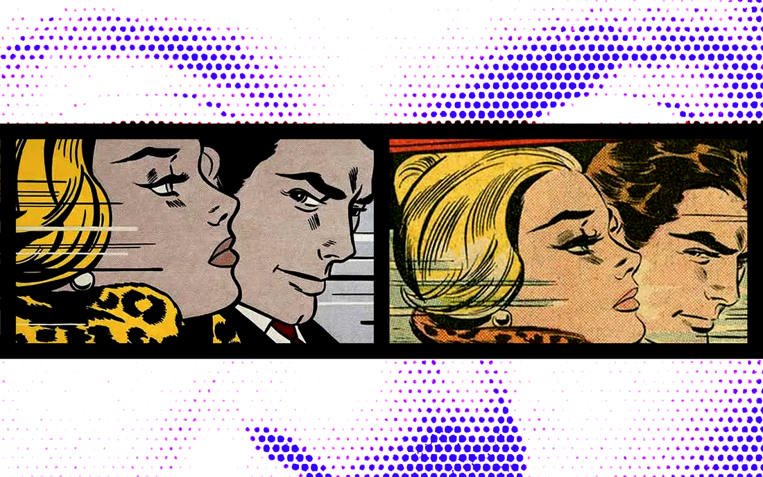
photo manipulation & text by nacrowe
the conversation surrounding the ETHICS involved in APPROPRIATIVE ART is a CONTENTIOUS and CONTROVERSIAL subject. look no further than that APOCHRYPHAL PABLO PICASSO line "good artists borrow, great artists steal" that gets at the heart of the matter, which is that when it comes to ART, like LOVE and WAR, there are essentially no rules. to the contrary, the amalgamation and interweaving of IDEAS into new FORMS and CONTEXTS is arguably how the CULTURE propels itself forward.
no doubt that was the ETHOS of CELEBRATED POP ARTIST ROY LICHTENSTEIN when he appropriated the CREATIVE WORK of largely UNKNOWN mid-century COMIC BOOK ILLUSTRATORS into has large-scale canvases. like ANDY WARHOL, he was involved in the process of identification and selection forwarded by DADA artist MARCEL DUCHAMP in which something COMMON, TRIVIAL and usually UTILITARIAN in value gets plucked from effective OBSCURITY to be transformed into high ART. WARHOL chose CAMPBELL soup cans and BRILLO pad boxes as EMBLEMATIC of a NEW VISIAL LANGUAGE and AESTHETIC surrounding CONSUMERIST concepts like manufactured desirability. in the post-war period, this IDEA of taking a DUCHAMPIAN eye for TRANSFORMATIVE selection unto MASS MARKETED PRODUCTS and ADVERTISEMENT CAMPAIGNS was NOVEL and REVOLUTIONARY. likewise, LICHTENSTEIN was transforming these DISCARDABLE COMIC BOOK panels, the argument goes, into something else entirely. that ART of DUCHAMPIAN selection placed them in an entirely NEW CONTEXT and in front of an DIFFERENT AUDIENCE for a DIFFERENT PURPOSE. this CONCEPT is lost in the recent WHAAM! BLAM! ROY LICHTENSTEIN AND THE ART OF APPROPRIATION (VIRGIL FILMS, 2023) documentary, which has a more common REDUCTIVE view of the situation in which exploited COMIC BOOK ARTISTS like HY EISMAN and RUSS HEATH had some of their CREATIVE WORK repurposed with no attribution, acknowledgement or payment as the OBSCURE source of said PAINTINGS. legally no payment is due to them since they dont own the rights to their WORK, as it is understood that the firm they worked for held the copyrights and thus the standing to sue LICHTENSTEIN back in the day. which they didnt since the potential earnings from said litigation was NOMINAL at best in the 1960s. that these LIMITED PAINTINGS are now highly SOUGHT-AFTER by global billionaire class and now go for hundreds of millions of dollars each at auction is IMMATERIAL. but it all does ring more than a bit UNFAIR. at least to EISMAN and HEATH who are on limited fixed incomes late in life and in some cases use CHARITABLE services to get by from an INDUSTRY that saw them as common CRAFTMEN and not ARTISTS in their own right. its a different story these days regarding common practices in publishing with many ILLUSTRATORS retaining control of their WORK and licensing it to for a limited period to publishing houses. you most definitely feel for EISMAN and HEATH and the manner in which they were essentially rendered MUTE and INVISIBLE by both the COMIC BOOK INDUSTRY and the legal system at large, but in a WEIRD sense this film, based on the scholarly work of DAVID BARSALOU of the DECONSTRUCTING LICHTENSTEIN website (linked HERE), is a PERMANENT testament to their contributions to the work of LICHTENSTEIN. this film is that awaited credit and attribution, not by the ARTIST himself (who passed in 1997), but by the COMMUNITY itself. at least that counts for something in this CAUTIONARY tale. 
photo manipulation & text by nacrowe
ive never been able to get a read on JULIAN SCHNABEL. even before watching the recent JULIAN SCHNABEL: A PRIVATE PORTRAIT (BUENA ONDA, 2017) RETROSPECTIVE DOCUMENTARY that serves as a PERSONAL narrative regarding his CREATIVE OUTPUT, as well as the MEANINGFUL relationships he amassed along the way, i knew him through his UNCONVENTIONAL and highly PERSONAL FILMS. namely BASQUIAT (MIRAMAX, 1996), BEFORE NIGHT FALLS (FINE LINE, 2000) and THE DIVINE BELL AND THE BUTTERFLY (MIRAMAX, 2007). each being its own UNIQUE CINEMATIC UNIVERSE unto themselves with the through line being his ability to defy audience expectations and invariably impress upon them a highly AFFECTING FOCUS on MOOD and the EMOTIONAL INTERIORITY of his character's PSYCHE. i have walked out all three of his movies with an ELEVATED sense of my own PERCEPTUAL EXPERIENCE as a human and how such affects my relationships and sense of SELF.
but that could all just be me projecting unto his WORK. which i believe might be the point of any TRUE ARTIST. although still INDECIPHERABLE, this documentary showcases a REFLECTIVE PROCESS with his WORK that finds him EVER-AWARE and even HYPER-VIGILANT for new opportunities and avenues of EXPRESSION, whether such be 'mistake' on CANVAS or in the EMOTIONAL pull of a CINEMATIC SCENE. everything is mined for its emotive potential in service of ITSELF. this ability to both improvise as a COMPOSITIONAL COMPONENT to his FILMS is partly what draws such TALENT and ADMIRATION from actors such as WILLEM DAFOE and AL PACINO, both participants in this FILM. arguably the moment in the FILM where these threads of EXPRESSION (MUSIC, ART and CINEMA) come together is in MULTI-MEDIA PRODUCTION surrounding LOU REED's late-career PERFORMANCE of his MUCH-HERALDED but famously DEBAUCHED BERLIN (RCA, 1973) album. what REED does with WORDS and MELODY, EVER-SHIFTING around his catalogue to his latest ARTISTIC PREDILECTIONS irrespective of audience expectation is essentially the model of SCHNABEL on CANVAS and CELLULOID. for me that moment was more INSIGHTFUL and MEANINGFUL than past FAMILY memories of NEW YORK and TEXAS, where he grew up. the SPONTANEOUS act of CREATION and being completely FEARLESS about such is what makes this FILM COMPELLING, if not entirely MYSTIFYING and OPAQUE. im still not sure entirely what i make of SCHNABEL or what i learned given this FILM, but at least it makes me aware of how perplexing the PROCESS of ARTISTIC GENERATION actually is since it comes from a place of INCREDIBLE INTENT, FOCUS and EMOTIONAL VULNERABILITY. such a state i'll likely never fully appreciate. JULIAN SCHNABEL: A PRIVATE PORTRAIT is an EVER-INTRIGUING FILM that i will no doubt revisit in the future. 
nobuyoshi araki photos from yokohama museum of art exhibition taken by nacrowe
so back in 2016 when i was teaching abroad in JAPAN i was lucky enough to be nearby the YOKOHAMA MUSEUM OF ART who was putting on an exhibition curated by the RENOWNED ARTIST TAKASHI MURAKAMI that included wildly ECLECTIC PIECES from the likes of ANSELM KIEFER, KIM GORDON, YOSHITOMO NARA, HENRY DARGER, BARY MCGEE, KAWS, SEONNA HONG and AI HABARA to TERRY RICHARDSON, NAOYA HATAKEYAMA, JAMES JEAN, CLAUS OLDENBURG, RICHARD HAMILTON, ROBERT RAUSCEHNBERG, ANDY WARHOL, ROY LICHTENSTEIN, JAMES ROSENQUIST, BARBARA KRUGER and DR. LAKRA. it was easily one of the CULTURAL HIGHLIGHTS of my time living and working in YOKOHAMA.
out of all that SURREAL, vividly colored, ANIME and POP CULTURE-inspired fair from that exhibit (titled TAKASH MURAKAMI's SUPERFLAT COLLECTION: FROM SHOHAKU AND ROSANJIN TO ANSELM KIEFER), the work that hit the hardest were these INTIMATE and UNSETTLING black-and-white photographs by a JAPANESE PHOTOGRAPHER i was hitherto UNFAMILIAR with named NOBUYOSHI ARAKI, or ARAKI. the PHOTOS were from an extended three-part series devoted to his wife AOKI YOKO that showcased her at different points in their relationship, from their 1) their honeymoon in 1968 to 2) her demise and ultimately her passing from OVARIAN CANCER in 1990 and 3) the empty apartment she left thereafter. it is INTRIGUING, partly since today ARAKI is NOTORIOUS and internationally celebrated for his TRANSGRESSIVE portfolio of PHOTOGRAPHS related to EROTICISM and KINBAKU, or ROPE BONDAGE. JAPAN is a traditionally an extremely socially CONSERVATIVE place, so this subject matter inherently is regarded as TABOO and incredibly SUBVERSIVE in-country. that his early PHOTOS are these lovingly depicted CHERISHED moments with the love of his life as their relationship was blossoming is as HEART-WARMING as it is emotionally DEVASTATING. even when i didnt know the personal story behind the PHOTOGRAPHS, there seemed to be a MELANCHOLIC aspect to them. as if that documenting of such an INTIMATE moment, now distanced by time, is highly EMOTIVE and BITTERSWEET in its PURITY. i remember being immediately taken by these PHOTOGRAPHS in a similar way to that of other PROVOCATIVE PHOTOGRAPHERS such as DIANE ARBUS and ROBERT MAPPLETHORPE. the SHOCK VALUE in my mind is derived from the unyielding INTIMACY of the subject with that of the PHOTOGRAPHER. ARAKI's WORK, especially those three series centered around his much BELOVED deceased life partner are the epitome of such and are highly AFFECTING and POWERFUL. RIP AOKI YOKO 
photo manipulation & text by nacrowe
it was a bit hard to get a decent read on the intent behind the brief DAMIEN HIRST: MORBID FASCINATION (ENTERTAIN UK, 2022) documentary, which focused on the NOTORIOUS BRITISH PAINTER and CONCEPTUAL ARTIST. the most FAMOUS of the YBAs (Young British Artists) that came out of GOLDSMITH'S COLLEGE in the late 80s and early 90s, which coincidently rose to CULTURAL PROMINENCE around the same time as the BRITPOP movement of young INDIE ROCK bands, DAMIEN HIRST is the embodiment of BRITAIN's return to CULTURAL RELEVANCY in the EUROPEAN ART scene and beyond.
and for that he is much BELOVED and HATED. some see him as an ABSOLUTE CHARLATAN whose WORK is POMPOUS, SUPERFICIAL and highly OVERRATED. others see him as a MODERN conceptual extension of the likes of CONCEPTUAL ARTISTS such as MARCEL DUCHAMP, ANDY WARHOL and JEFF KOONS in how he isolates innately PROVOCATIVE objects and ingeniously RE-CONTEXTUALIZES them to spur popular discussion and critical evaluation of COMPLEX and INTERRELATED EXISTENTIALIST themes such as NATURE, MORTALITY, RELIGION, IMPERMANENCE, BELIEF and CONSUMER CULTURE. like i said before it is difficult to get a sense from where MORBID FASCINATION stands on this issue as it doesnt seem to advocate for either side, more just presenting both sides as equally RELEVANT. this is FRUSTRATING since the fact that there is interest enough in HIRST in the first place to take the necessary TIME and ENERGY to film, edit and manufacture this product proves his INHERENT VALUE enough as an ARTIST to be considered WORTHY of being critically analyzed and dissected. somehow this line of inquiry feels so TRAGICALLY BRITISH, since only they will seemingly go through the effort to produce a documentary about the merits of making said documentary. i dont much care about your reasoning, just get on with the task at hand already. there is an UNFORTUNATE preoccupation in this film about HIRST's MARKETING PROWESS and preternatural ability to PROMOTE and SENSATIONALIZE his WORK in the press and thus draw a SUBSTANTIAL PRICE for such at auction. again, that is a BORING topic since such a discussion doesnt confirm or deny the MERIT of his WORK, just its current MARKET VALUE. my hope when watching this documentary was to get a better sense of his ARTWORK and how its THEMES interplay with the work of his PEERS, both preceding him like FRANCIS BACON or concurrently such as fellow NOTABLE YBA SARAH LUCAS. regrettably most of this short film was dedicated to his NOTORIETY and supposed CONTROVERSIAL STATUS within the ART COMMUNITY without naming names. it all just comes across as SUBPAR and lacking any real DEPTH. not gonna lie, DAMIEN HIRST: MORBID FASCINATION felt like WASTED OPPORTUNITY on a subject that is innately INTRIGUING and whose WORK is demonstrably WORTHY of a critical eye. the never-ending UNCRITICAL focus and SUPERFICIAL preoccupation with MONEY was the TRUE "MORBID FASCINATION" of this film, and not HIRST or his ARTWORK. probably best to search for better fair elsewhere since this film is definitely not worth checking out. 
photo manipulation & text by nacrowe
SHOT! THE PSYCHO-SPIRITUAL MANTRA OF ROCK (MAGNOLIA, 2016) is an absolutely FASCINATING documentary about the TRANSCENDENT and often MERCURIAL mystery that is the state of being an ARTIST. the late ENGLISH PHOTOGRAPHER MICK ROCK of course is a cultural legend, mostly due to the GROUNDBREAKING visuals he produced during the 1970s GLAM ROCK scene in the LONDON as well as the work he created for PROMINENT MUSICIANS in SYD BARRETT, DAVID BOWIE, IGGY POP and LOU REED. in particular BOWIE and REED were close confidants and collaborators during that period. THE STOOGES' RAW POWER (COLUMBIA, 1973), LOU REED's TRANSFORMER (RCA, 1972), DAVID BOWIE's PIN UPS (RCA, 1973), QUEEN's QUEEN II (ELEKTRA, 1974), RAMONE's END OF THE CENTURY (SIRE, 1980) and SYD BARRETT's THE MADCAP LAUGHS (HARVEST, 1970) are some of the ALBUM OVERS ROCK is most famously associated with, but he went on to have a lasting IN-DEMAND career right up until his passing in 2021 that saw him create ICONIC PORTRAITS of everyone from DEBBIE HARRY, JOHN LYDON, MADONNA, ROXY MUSIC, JOAN JETT, R.E.M., OZZY OSBOURNE, TALKING HEADS and BOB MARLEY to MILEY CYRUS, JANE'S ADDICTION, SNOOP DOGG, THE MISFITS, JOSH HOMME, MOTLEY CRUE, KAREN O, DAFT PUNK and LADY GAGA. ROCK was a SINGULAR VISIONARY whose vast CATALOGUE speaks for itself.
but that is not what makes this film so COMPELLING. ROCK was a CAMBRIDGE-trained STUDENT of modern and medieval languages who was absolutely obsessed with SYMBOLIST POETS such as ARTHUR RIMBAUD, CHARLES BAUDELAIRE and LORD BYRON. in DAVID BOWIE, IGGY POP and especially LOU REED he was drawn to their COMBUSTIBLE energy that was both intellectually STIMULATING, yet completely DEBAUCHED. they were this generation's truth-sayers and poets in the flesh and ROCK's PHOTOGRAPHY would essentially come to serve as the PROPAGANDA arm of that movement. what i found INTERESTING about ROCK's process were the lengths he went through, namely yoga and drugs, to get outside of his CEREBRAL mind and get INSTINCTUAL. the CELEBRATED mid 20th-century FRENCH photographer HENRI-CARTIER BRESSON wrote and spoke effectively about capturing what he called 'THE DECISIVE MOMENT,' when the ARTIST adroitly manipulates the MEDIUM to the extent that they bend it to their will unconsciously. ROCK talks in the film about how his subject by definition is the most INTRIGUING thing in the world, irrespective of the ACTUAL REALITY differing. he is almost channeling the SUBJECT and taking what is being given, and guiding them in the process without being CONSCIOUS of such, as evidenced by the PHOTO SESSIONS filmed for this documentary. the fact that a man so WELL-READ and EDUCATED felt compelled to pursue a PROFESSION that is about being immediately RESPONSIVE and IN-THE-MOMENT sans intellectual forethought is an absolutely CAPTIVATING dichotomy. the film delves into his inability to turn off the forward momentum and the chasing of said muse through late night cocaine benders, orgies and crazy nights that turned into days or even a week of SLEEPLESS bodily abuse. it all caught up when he had several heart attacks in his early 40s which saw him re-evaluate his life choices and pursue a more MODERATE path forward, which found him married and with a family in STATEN ISLAND of all places. much like DAVID JOHANSEN, ROCK was a fixture on the north shore but was given his space and privacy. i know he sold signed copies of his ICONIC PHOTOGRAPHS of DEBBIE HARRY, DAVID BOWIE, FREDDIE MERCURY, IGGY POP and LOU REED and i believe even donated a few for a fundraiser for the non-profit internet radio station i am involved with in STAPLETON. i never met him but i know people from the station that did. he was just another guy. a dude with a monster talent and one of the most coveted and INTIMATE back CATALOGUES of CULTURALLY SIGNIFICANT PHOTOGRAPHS ever, spanning everything from PROGRESSIVE ROCK, GLAM ROCK, PUNK ROCK, NEW WAVE, GLAM METAL, POP and so on to the present. it should also be noted that the CINEMATOGRAPHY is also absolutely STELLAR throughout. a fitting first-hand testament to the late great creator of IMAGES. SHOT! THE PSYCHO-SPIRITUAL MANTRA OF ROCK is most definitely worth checking out. 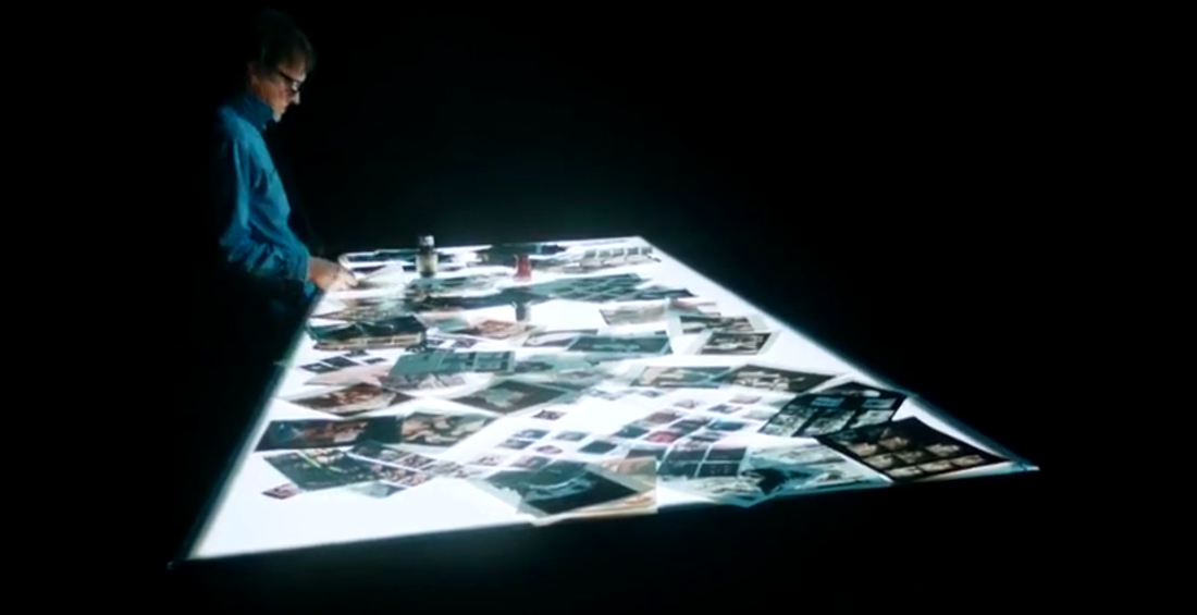
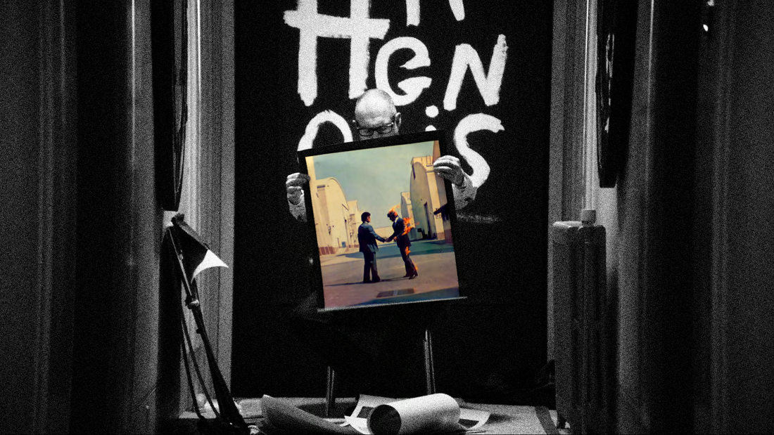
photo manipulation & text by nacrowe
the almost ALCHEMICAL interplay between the VISUAL and the AURAL is one of the most POWERFUL relationships i can think of. look no further than the INDELIBLE film scores of RENOWNED composer BERNARD HERRMANN devoid and in complete isolation from his association with the cinematic work of collaborating filmmakers in ORSON WELLES [CITIZEN KANE (RKO, 1941)], ALFRED HITCHCOCK [PSYCHO (PARAMOUNT, 1960), VERTIGO (PARAMOUNT, 1958), NORTH BY NORTHWEST (MGM, 1959), THE BIRDS (UNIVERSAL, 1963)], BRIAN DEPALMA [SISTERS (AMERICAN INTERNATIONAL, 1972), OBSESSION (COLUMBIA, 1976)] and MARTIN SCORSESE [TAXI DRIVER (COLUMBIA, 1976)]. the key concept is that score complements the film and the POWER and MAGIC comes from the two working in tandem.
the same dynamic is at play with ALBUM ARTWORK, which arguably was at its zenith in the 1960s and 1970s when the cultural ubiquity and embrace of vinyl records allowed for an ACCESSIBLE format that presented as an ARTISTIC CANVAS. it was during this period that the ENGLISH firm HIPGNOSIS, made up of the collaborative duo STORM THORGERSON and AUBREY POWELL, emerged out of CAMBRIDGE came to dominate the market with wildly IMAGINATIVE and ICONIC visual images for LEGENDARY acts of the period including PINK FLOYD, LED ZEPPELIN, T. REX, PETER GABRIEL, AC/DC, WISHBONE ASH, 10CC, DEF LEPPARD, YES, ELECTRIC LIGHT ORCHESTRA, UFO and BLACK SABBATH among numerous other artists. a quick rundown of their most CELEBRATED COVERS include numerous PINK FLOYD [A SAUCERFUL OF SECRETS (EMI COLUMBIA, 1968), ATOM HEART MOTHER (HARVEST, 1970), THE DARK SIDE OF THE MOON (CAPITOL, 1973), WISH YOU WERE HERE (COLUMBIA, 1975), ANIMALS (COLUMBIA, 1977)] and LED ZEPPELIN [HOUSES OF THE HOLY (ATLANTIC, 1973), PRESENCE (SWAN SONG, 1976), IN THROUGH THE OUT DOOR (SWAN SONG, 1979)] and PETER GABRIEL [CAR (CHARISMA, 1977), SCRATCH (CHARISMA, 1978), MELT (CHARISMA, 1980)] releases as well as T. REX's ELECTRIC WARRIOR (REPRISE, 1971), GENESIS' THE LAMB LIES DOWN ON BROADWAY (CHARISMA, 1974), AC/DC's DIRTY DEEDS DONE DIRT CHEAP (ATLANTIC, 1976) and SYD BARRETT's THE MADCAP LAUGHS (HARVEST, 1970). all that being said, the recent SQUARING THE CIRCLE: THE STORY OF HIPGNOSIS (RAINDOG, 2022) documentary centers around the UNIQUE working relationship of THORGERSON and POWELL and the cultural moment their WORK embodied and defined. the narrative is told largely from the PERSPECTIVE of the surviving POWELL, as THORGERSON passed away in 2013, as well as FAMOUS clients such as PAUL MCCARTNEY, PETER GABRIEL and PROMINENT members of PINK FLOYD (ROGER WATERS, DAVID GILMOUR and NICK MASON) and LED ZEPPELIN (JIMMY PAGE and ROBERT PLANT) as well as NOTEWORTHY non-clients GLEN MATLOCK (THE SEX PISTOLS) and NOEL GALLAGHER (OASIS). what is presented is that the INTIMATE yet CONTENTIOUS artistic collaboration between THORGERSON and POWELL was one of UNCOMPROMISING vision that repeatedly took big swings and big risks, and at times took big losses, that effectively stationed them as the vanguard CREATIVE VISUAL FIRM of the era. oftentimes they were ahead of the audience, as well as their clients. this INSULAR CREATIVE PROCESS is in stark contrast to today's more MARKET-DRIVEN and research GROUP-TESTED approach that puts a premium on riding current trends then innovating and pioneering new terrain. GALLAGHER functions as a later-generation fan of HIPGNOSIS and the era they represented, as well as the living embodiment and surrogate figure for the disappointment of what e-commerce and social technology has done to the quality of ARTWORK and the ALCHEMICAL POWER and MAGIC of such that has seemingly dissipated in decades since. to a degree, HIPGNOSIS was always dealing with the creation of a commodity that was to be sold in a marketplace, but there was a real connection to an audience that elevated said VISUALS to a sense of raised CONSCIOUSNESS and aesthetic appreciation. i do not believe fans are looking for that same connection to the VISUALS (and arguably the MUSIC) anymore in popular music that has widespread appeal. everything seems more geared towards entertainment with the shelf-life of a TIKTOK feed, which is all kinds of SAD and TRAGIC, but that is the current state of affairs regarding such. ultimately the partner of THORGERSON and POWELL didnt last through the 1980s as tastes changed and their era was seen as BLOATED and PRETENTIOUS. owing money to their creditors, THORGERSON didnt pay his end and the personal relationship of both soured irreparably. this emotional and psychic WEIGHT is adroitly visually evoked and represented by director ANTON CORBIJN in STARK, high-contrast black-and-white with POWELL physically laboring to carry his creative work in a large, CUMBERSOME over-the-shoulder bag through an abandoned side road somewhere in a NAMELESS, MISTY ENGLISH countryside. this film seemingly represents an attempt at putting the past into context, all the professional triumphs and the personal toll extracted along the way, in an attempt to excise such from his conscious. i should give mention that CORBIJN is the perfect director for this type of project, himself being responsible for ICONIC IMAGES, ALBUM COVERS and MUSIC VIDEOS associated with everyone from JOY DIVISION, ECHO & THE BUNNYMEN, DEPECHE MODE, U2 and NIRVANA. CORBIJN, much like HIPGNOSIS is a fellow alchemist in this POWERFUL and deeply MAGICAL interplay between all things VISUAL and AURAL. i was blown away by this film and heavily recommend it to anyone interested in the intersection of ART, IMAGE and COMMERCE. 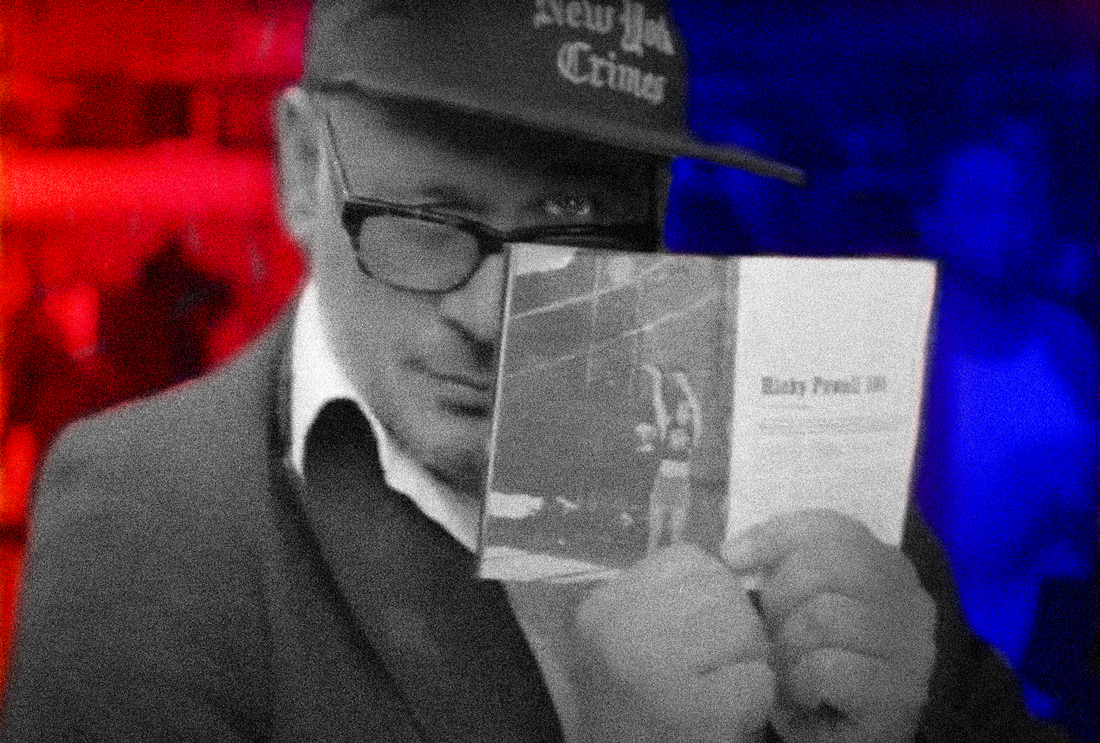
photo manipulation & text by nacrowe
"sometimes, there's a man, well, he's the man for his time and place. he fits right in there. and that's the dude." - THE BIG LEBOWSKI (POLYGRAM, 1999)
it is difficult to watch the recent RICKY POWELL: THE INDIVIDUALIST (TIME STUDIOS, 2020) about the much BELOVED late PHOTOGRAPHER RICKY POWELL and not come off astonished at the CASUAL CHARISMA and INTUITIVE EFFORTLESSNESS with which he interacted with his SUBJECTS and life in general. his PHOTOGRAPHS, especially those that showcased the early HIP HOP scene of the 1980s (RUN-DMC, LL COOL J, BEASTIE BOYS, PUBLIC ENEMY) as well as the concurrent modern art scene of the period (JEAN-MICHEL BASQUIAT, KEITH HARING, FUTURA, ANDY WARHOL), showcased a level of fly-on-the-wall, BEHIND-THE-SCENES INTIMACY that made them have a sense of URGENCY and feel forever IN-THE-MOMENT. the moment is FLEETING, but POWELL's POWER as a PHOTOGRAPHER was his ability to project through his work a SEAMLESS level of integration between ARTIST and SUBJECT that can only come with the later feeling truly SECURE and COMFORTABLE in the former's presence. his gift in other words, was his (like THE DUDE) ability to be SIMPATICO with his surroundings. one of the UNIQUE ironies is that although as a PHOTOGRAPHER who primarily shot CELEBRITIES, he was constantly not on his own turf, being on tour buses, backstage rooms, restaurants, art galleries, museums, but through his PHOTOGRAPHS these CELEBRITIES were really in his world. somebody in the film makes the comment that the purpose of these MUSICIANS and ARTISTS very existence was for him to document them, so respected was his TALENT and EYE. i remember a relative of mine that has long worked in the FILM INDUSTRY once told me about an upcoming MUSICIAN that befriended a famous ACTOR in the 1990s. this ACTOR had access to a private jet and took his new friend on a world tour of sorts as part of his entourage which apparently lasted a few years. the musician effectively stopped writing new material and eventually returned back to a reality in which he had rent due and bills to pay. so he asked the actor for money and that was it. he was cut off. the whole experience set him back and whatever momentum his career trajectory he was on a few years prior was irreparably dashed because of his temporary dalliance with the jet set crowd and that lifestyle. watching RICKY POWELL: THE INDIVIDUALIST made me think of that scenario immediately. yes, POWELL was TIGHT with the BEASTIE BOYS and was undoubtedly part of their crew for almost a decade, you know, UNTIL HE WASNT. instead of transitioning from that experience into the next phase of his career, he instead became a HERMIT in his downtown studio apartment and effectively separated himself from society for a few decades. the film gets into his HORRIBLE upbringing by a single mother who cherished her animals more than her son, but it doesnt take a psychologist to realize that these ARTISTIC and MUSICAL COMMUNITIES POWELL so effortlessly surfed between were SURROGATE FAMILIES of sorts. and when those RELATIONSHIPS came to a natural end, he was left to make sense of the pieces. i found this documentary to be very MELANCHOLIC with this highly CHARMING yet unbearably VULNERABLE figure of POWELL. the fact that he dies alone from cardiac arrest shortly after filming is almost too TRAGIC to take in. he had such a UNIQUE GIFT and such a preternatural EMPATHETIC ability to connect with STRANGERS, FAMOUS or otherwise. its too much to bear that he seemed to be LONELY sans a family his whole life. he almost came resigned to the fact that the search wasnt worth it. again, just DEVASTATING. in the past two years i have been lucky enough to secure copies of both of his much SOUGHT-AFTER PHOTOGRAPHY COLLECTIONS OH SNAP! (ST. MARTIN'S GRIFFIN, 1998) and THE RICKFORD FILES (ST. MARTIN'S GRIFFIN, 1999), so i was very much motivated to seek out this documentary once i learned of its existence. i see the film as ESSENTIAL and definitely recommend it to anyone interested in the beginnings of HIP HOP or the UNDERGROUND graffiti art scene of 1980s NEW YORK CITY. NOTABLE interview participants include PROMINENT rappers such as LL COOL J, DARRYL "DMC" MCDANIELS (RUN-DMC), CHUCK D (PUBLIC ENEMY), FAB 5 FREDDY and MIKE D (BEASTIE BOYS), producers MARIO "C" CALDATO and MARK RONSON, publishers DAVID HERSHKOVITZ (PAPER MAGAZINE) and JODI PECKMAN (ROLLING STONE) as well as NEW YORK actors like NATASHA LYONNE, LAURENCE FISHBURNE, DEBI MAZAR and VIN DIESEL, and artists like FUTURA, ZEPHYR, KAVES, MAX PERLICH, CHERYL DUNN, CEY ADAMS, SUE KWON and PATRICK MCMULLAN. 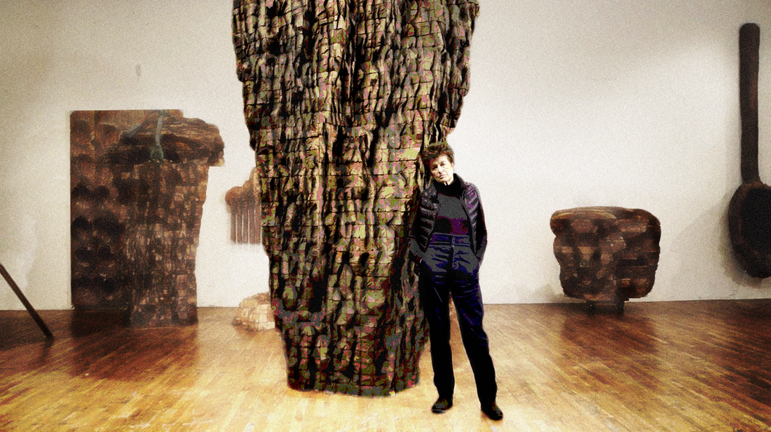
photo & text by nacrowe
the EMOTIONAL INTIMACY that paradoxically comes with SCALE is something of a central feature in the CREATIVE WORK of globally revered SCULPTOR URSULA VON RYDINGSVARD. as the daughter of UKRAINIAN and POLISH immigrant parents to the UNITED STATES who was born in GERMANY and spent her early youth in a GERMAN detention center during WORLD WAR II, her work is undoubtedly influenced by her EXPERIENCES between cultures and continents. the recent URSULA VON RYDINGSVARD: INTO HER OWN (ICARUS, 2019) documentary explores her career and personal history and exposes an artist with a deep sense of COMPASSION and value in COMMUNITY, both familial and adopted.
the film goes to great lengths to relay the idea that VON RYDINGSVARD did not have an ideal childhood, even after her families relocation to suburban CONNECTICUT. her father had an INDOMITABLE WORK ETHIC but a very real sense of INFERIORITY to his new compatriots that he tragically sublimated on his children quite mercilessly with long-lasting consequences. the FRUSTRATION and RAGE at the physical and psychological ABUSE inflicted by her father was something of a motivating catalyst for VON RYDINGSVARD and her CREATIVE WORK throughout her development well into career. her work, which historically is based in CEDAR but has in recent years has expanded to include COPPER and BRONZE commissions, is often of a MASSIVE SCALE with minute LABOR-INTENSIVE, HAND-CRAFTED TEXTURES and SURFACE MANIPULATIONS. the result is an IMPOSING monument with distinctly ORGANIC UNDULATIONS that doesn't mimic, yet takes key inspiration from nature. one can project the seeming PERMANENCE of trees or the EPHEMERALITY of clouds onto her WORK, which feel both ABSTRACT and distinctly AUTHENTIC and rooted in the ENVIRONMENT of their installation, wether such be in a BUCOLIC pasture or a CONGESTED urban setting. the film makes the point of connecting the BILLOWING FORMS of her scale work with that of WHEAT STACKS in POLAND, a land she was connected to through BLOOD and GENEALOGY but had never visited when being made aware of the connection by her second husband, the LATE NOBEL PRIZE-winning NEUROSCIENTIST PAUL GREENGARD. their seems to be an affinity for FORMS and MATERIALS that brought her COMFORT as a child, as she remembers being in a small makeshift wooden room with her CLOSE-KNIT family in GERMANY during the WAR, the structure providing SECURITY and SOLACE from the HORRORS outside. in this sense her use of WOOD as a MATERIAL seems anchored in a subconscious desire for a state of BALANCE that was never achieved on either shore. as a young woman having moved out to the BAY AREA, VON RYDINGSVARD had a child from a DISASTROUS first marriage with a partner that had a PSYCHOTIC BREAK and was later institutionalized with a diagnosis of schizophrenia. she made the decision to return to the EAST COAST in the mid 1970s and started pursuing her CREATIVE WORK in a SOHO loft (then absolutely not a chic address) with a young daughter in tow. she also took classes at COLUMBIA UNIVERSITY, where she earned her MFA. it feels like her success was HARD-EARNED with much STRUGGLE both financially and psychologically given her INTENSE family history. for VON RYDINGSVARD, NEW YORK CITY during this period was something of a revelation with many female artists making a name for themselves. she took inspiration from an EXPANDED sisterhood of in fellow SCULPTORS (EVA HESSE, LOUISE BOURGEOIS, LYNDA BENGLIS), COMPOSERS (MEREDITH MONK), PAINTERS (HELEN FRANKENTHALER, LEE KRASNER, JOAN MITCHELL), PHOTOGRAPHERS (CINDY SHERMAN) and CONCEPTUAL / MULTI-MEDIA / PERFORMANCE ARTISTS (JOAN JONAS, NANCY SPERO, YOKO ONO, ANNA MENDIETA, CAROLEE SCHNEEMANN, HANNAH WILKE, TRISHA BROWN, YVONNE RANIER). in NEW YORK CITY she found a home that allowed her the FREEDOM to reach her full potential through her CREATIVE INSTINCTS and the INDOMITABLE WORK ETHIC she inherited. the film makes the point of commenting that her WORK in some aspect is also about the idea of LABOR, of the TACTILE nature of INTENSE BODILY MANIPULATION of MATERIALS. its almost akin to the labor exhibited in the NATURAL WORLD with the ELEMENTS quietly eroding rock into EVERMORE COMPLEX MANIPULATIONS, whether such be through the vehicle of OCEANIC WIND GUSTS, ICE SHEETS, ROLLING RIVERS or SAND-BLASTED FURRIES of RISING AIR. that ever-constant process of becoming seems to be the point to some extent. you can see her joy at the final CONSTRUCTION of her installations as the realized form of the work of her and her close team of associates becomes apparent. all that minute WORK and hours of DECISIONS and DELIBERATIONS manifest in a PERMANENT FORM. those choices feel like a process based in a deep appreciation of NATURE and the complex systems that exact physical changes on ROCK FORMATIONS, GLACIERS and RIVERBANKS. its a deeply INTRIGUING dynamic to watch in isolation and URSULA VON RYDINGSVARD: INTO HER OWN provides a COMPELLING glimpse of such. 
photo manipulation & text by nacrowe
with DECONSTRUCTIVIST fashion designers like REI KAWAKUBO (COMMES DE GARCON), YOHJI YAMAMOTA (Y-3) and the late VIRGIL ABLOH (OFF-WHITE) being the current exalted avatars of a distinctly MINIMALIST AESTHETIC, the timing seems correct to reappraise the lasting and continuing cultural relevance of BELGIAN designer MARTIN MARGIELA of MAISON MARGIELA and his INNOVATIVE approach to FASHION DESIGN and PRESENTATION. NOTORIOUS for not granting interviews or appearing on camera, in the recent retrospective documentary MARTIN MARGIELA: IN HIS OWN WORDS (AMINATA PRODUCTIONS, 2020), MARGIELA functions as an of-sorts narrator to his own story while maintaining his complete anonymity.
the conceit of the film is in essence in an INDUSTRY where FAME and CELEBRITY are fleeting come and go with new collections each subsequent season, MARGIELA was able to construct a NOVEL VOCABULARY and DESIGN AESTHETIC that has lasted far beyond his twenty year reign at his former namesake fashion house, which ended in 2009. he was in COMPLETE CONTROL throughout and resigned only when the business side, due to expansion and the success of the brand, began to inevitably dictate and encroach on his ARTISTIC VISION. in this manner his departure maintained the PURITY of his collections, which were his legacy. and that focus on the product was INTENTIONAL. famously, MARGIELA left the press alone to make sense of his COLLECTIONS, providing no input, direction or CONTEXT as is the INDUSTRY PRACTICE. in this manner he cultivated an EXPECTATION of INNOVATION and spurred fierce discussion, expression and enabled free thought with regards to his critics. he let them decide on their own how to approach and evaluate his work, with no pushback or encouragement on his end. this is basically unheard of in the FASHION WORLD where HYPE is inextricably part of the game. for MARGIELA, THE WORK AND ONLY THE WORK was what mattered. period. and what about the actual clothes? MARGIELA is so REVERED because he essentially INVERTED all sorts of explicit and implicit EXPECTATIONS in the INDUSTRY. for instance he was CELEBRATED for REPURPOSING, RECYCLING, RE-CONTEXTUALIZING, discarded NON-PREMIUM MATERIALS with an almost MARCEL DUCHAMP-ian ability to RECONSTRUCT and REDETERMINE their VALUE and UTILITY through the power of CONCEPT. a MARGIELA item had value because of the IMAGINATIVE idea behind it, not the SCARCITY of the MATERIAL itself. similarly, his GARMENTS provided an almost META-NARRATIVE regarding their creation, DECONSTRUCTING for the wearer the process by which they were conceived and constructed. even the labeling was UNIQUE and somewhat of an ANTI-LABEL statement, with four RUDIMENTARY corner stitches along a rectangle of light FABRIC, sometimes unmarked itself. the result was four corner stitches exposed on the outside of the GARMENT, making it appear INCOMPLETE and still in the process of being manufactured. MARGIELA even confronted the PRESENTATION of his work, often casting NORMAL women as models (known as street casting) and utilizing UNCONVENTIONAL off-site venues (such as parking garages, beneath bridges, vacant outdoor lots) to unveil his work in UNEXPECTED CONTEXTS. in summation, his work was highly CONCEPTUAL and played around and CHALLENGED LONG-HELD IDEAS concerning the INCEPTION, CONSTRUCTION and PRESENTATION PROCESSES involved with the design of clothes. virtually anyone today that is SUBVERTED EXPECTATIONS through DECONSTRUCTING such in a NOVEL way is taking a cue from the playbook invented by MARGIELA, which is why he is still more than a decade later into his retirement such a REVERED figure. my interest is not so much with FASHION itself, but with visionaries that CHALLENGED, TRANSGRESSED and ultimately SUBVERTED the STATUS QUO to their will and invented a NEW LANGUAGE unto themselves in the process. people like FRANCIS BACON, HUBERT SELBY JR, PATTI SMITH, BILL HICKS, LOU REED, JENNIFER DOUDNA & EMMANUELLE CHARPENTIER, FRANK ZAPPA or MARLON BRANDO. MARTIN MARGIELA: IN HIS OWN WORDS is beyond compelling and most definitely worth checking out regardless of your interest in haute couture. 
photo manipulation & text by nacrowe
i only recently came to be aware of the early 20th century SELF-TAUGHT ARTIST BILL TRAYLOR of ALABAMA. born into SLAVERY, his family stayed and worked for their former owners as sharecroppers for 30 years after EMANCIPATION. little is known about his life other than he raised several children and had a few marriages throughout a long life sharecropping in the YELLOWHAMMER STATE. it was only in his 80s that he moved to MONTGOMERY and took up DRAWING, resourcefully repurposing whatever LEFTOVER MATERIALS he could find. in time he was a cultural fixture of the main thoroughfare of MONROE STREET with his deceptively SIMPLISTIC yet deeply EVOCATIVE FIGURE DRAWINGS of life both REAL and IMAGINED, past and present, ETHEREAL and disturbingly PALPABLE.
for decades after his passing in 1939 in OBSCURITY, TRAYLOR's work was likewise FORGOTTEN about and UNCELEBRATED. his work now is seen as a uniquely UNFILTERED link to a world long passed in which AMERICAN HISTORY saw one of its most CONSEQUENTIAL fulcrum points, i.e. the RECONSTRUCTION era and the uneven cultural and economic transition from SLAVERY in the AMERICAN SOUTH. a transition still in motion, with WIDE-RANGING consequences to present day. despite the dearth of PERTINENT information outside of state census records, the recent documentary BILL TRAYLOR: CHASING GHOSTS (BREAKAWAY FILMS NY, 2021) attempts to give voice to TRAYLOR by CONTEXTUALIZING him and his experiences within the greater tradition of AFRICAN-AMERICAN playwrights and poets of the era. its an INTRIGUING JUXTAPOSITION to see these scenes from NOTEWORTHY DRAMAS played out by actors with TRAYLOR's drawings interspersed in the mix. it provides a possible CONTEXT to material that otherwise is ironically almost OBTUSE in its DIRECTNESS, like witnessing an ANCIENT EGYPTIAN RELIEF PAINTING in a tomb out of CONTEXT. it is quite something that these INDELIBLE IMAGES TRAYLOR created were done utilizing the most MODEST of materials, mostly pencils with BASIC colors on the backs of used cardboard print advertisements or discarded scrap paper. the vast majority of his work was done on MAKESHIFT canvases of IRREGULAR shapes, which he resourcefully and ingeniously incorporated into the COMPOSITION. part of the reason that his WORK hits the way it does is the fact that it is UNSCHOOLED and retains a certain PURITY of PERSPECTIVE for a REALITY and WAY OF LIFE that even at the time of its creation post-1939 was of a bygone era. it mixes COLLECTIVE and LIVING MEMORY with the HOPES and DREAMS of a time to come that as an old man TRAYLOR must have been acutely aware of MORTALITY and inability to experience said progress. there is also a bit of mystery regarding the SUBLIME and more than a little HOODOO ICONOGRAPHY thrown in the mix, which again informs his individual and the wider cultural PERSPECTIVE of his COMMUNITY. that something so PROFOUND is wrapped up in something seemingly so RUDIMENTARY is quite an achievement in its own right and he deserves his just praises, even if such are posthumous and decades after the fact. it is a testament to the QUALITY and INTENT of his WORK that TRAYLOR's ART resonates right now in our era with our amassed COLLECTIVE MEMORY and HISTORICAL and CULTURAL BAGGAGE. its one of the mysteries of ART that such teaches us anew as CONTEMPORARY conditions evolve and reveal themselves, presenting new CONTEXTS and opportunities for GROWTH. here is hoping that TRAYLOR is a permanent part of that continuing NARRATIVE and discussion regarding the AMERICAN EXPERIMENT, with all of its acknowledged PAINFUL SHORTCOMINGS and CELEBRATED virtues alike. BILL TRAYLOR: CHASING GHOSTS is a COMPELLING documentary about a REVELATORY ARTIST that deserves further attention. i found it ESSENTIAL and is most definitely worth checking out. 
photo manipulation & text by nacrowe
with MODERN MEME CULTURE and INSTANTANEOUS global distribution via SOCIAL MEDIA, CONCEPTUAL ART that trades on PARODY and SATIRE is fairly commonplace. its part of the everyday LEXICON that being an engaged consumer of information in our DIGITAL AGE almost requires and it covers every POLITICAL STANCE, GENDER IDENTIFICATION and MORAL PROCLIVITY, for and against. its OVERWHELMING and one gets the sense that with the impending AI takeover of our VISUAL CULTURE things are going to move another rung in the POST-TRUTH world we have collectively stepped into.
with the RENOWNED AGITPROP artist RON ENGLISH there is a MORAL CENTER to his MASH-UP oil paintings and notoriously ILLEGAL guerrilla billboard campaigns that find him utilizing the VISUAL LANGUAGE of POP CULTURE against CORPORATE GREED and GOVERNMENT OVEREACH that does not have whats best for society in mind when game-planning decisions. the recent documentary POPAGANDA: THE ART AND CRIMES OF RON ENGLISH (CINEMA LIBRE, 2005) eloquently presents the risks and rewards of his RIGHTEOUS and REBELLIOUS VISUAL AESTHETIC that lampoons and eviscerates everything from the CORPORATE ICONOGRAPHY of RONALD MACDONALD, JOE CAMEL and MICKEY MOUSE to the VISUAL LANGUAGE of POWER innate in the UNITED STATES dollar as well as countless luxury items. its hard to not appreciate the man and his message of ENLIGHTENED SUBVERSION. especially with his CELEBRATED billboard campaigns that utilized the same FONTS, COLORS, MATERIALS and TEMPLATES used by advertisers. such billboard posters were so SEAMLESS and PROFESSIONAL that they would last a few days before being taken down. his effort was one of RECLAIMING PUBLIC SPACE and further continuing the conversation with marketing and advertising firms. he was attempting to democratize the VISUAL POLLUTION citizens are subject to on a daily basis. its all very INTERESTING because at its core these billboards are rather EPHEMERAL. yes, they have a (PASSIVE) audience that dwarfs that of a successful gallery exhibition, but ultimately his work will be discarded with a short shelf-life both in terms of the MESSAGE and the MEDIUM. such is why he made the decision to diversify into traditional oil painting. this is where i unknowingly became familiar with some of his work, namely the STRIKING album cover of THE DANDY WARHOLS' fourth album WELCOME TO THE MONKEY HOUSE (CAPITOL, 2003), KORN's THE SERENITY OF SUFFERING (ROADRUNNER, 2016) and ICONIC GUNS N' ROSES / VELVET REVOLVER guitarist SLASH's more recent SLASH (EMI, 2010), WORLD ON FIRE (ROADRUNNER, 2014) and LIVING THE DREAM (ROADRUNNER, 2018) solo releases. his style is BOLD and VIBRANT and makes use of models to provide ALTERNATIVE PERSPECTIVES on ICONOGRAPHY sourced from all things FILM, TELEVISION and FAST FOOD. his work is focused around the common CULTURAL APPROPRIATION of everyday icons mashed together OUT-OF-CONTEXT to great effect, but it isnt KITSCH. there is a deliberate statement being conveyed about the INHERENT DISPOSABILITY of daily AMERICAN life and the CRASS CONSUMERISM that seemingly defines our how the collective HOPES and DREAMS of our CULTURE are defined. it is difficult not to side with ENGLISH and discover DEEP HUMOR and IMMENSE HUMANITY in the CLEVER MESSAGING of his work. POPAGANDA: THE ART AND CRIMES OF RON ENGLISH is essential viewing in my opinion. 
photo manipulation & text by nacrowe
nearly two decades ago i was introduced to the work of MARK ROTHKO at 20th century retrospective of AMERICAN ART at THE WHITNEY at its old UPPER EAST SIDE location. i remember it with clarity because i attended this event with my parents and grandmother, who became visually and verbally upset when confronted with one of his RENOWNED COLOR FIELD PAINTINGS. she could not handle the fact that this painting was varying shades of black. for me there was no turning back. anyone that pissed off my grandmother was alright in my book and thus my interest in ROTHKO began in earnest.
THE SILENCE OF MARK ROTHKO (ICARUS, 2016) is a recent documentary that attempts to present the ABSTRACT PAINTER and his work as he intentioned it. assisting with this endeavor is his adult son CHRISTOPHER, who reads aloud his words and acts as a stand-in narrator of sorts. it is mentioned that he has a similar voice to that of his father. all this being said, ROTHKO and his COLOR FIELD PAINTINGS are deliberately OPAQUE and AMBIGUOUS to being with. it is as if the ARTIST is painting EMOTION on a purely SUB-COGNITIVE level. ever the CONTRARIAN, the film states that according to ROTHKO an ACADEMIC FORMAL ANALYSIS of his work via discussion of TRADITIONAL aspects like FORM, COLOR, TECHNIQUE, REPRESENTATION or ABSTRACTION are WELL-INTENTIONED but WRONG. he hoped for his work to be experienced, not watched. it feels like his work is an attempt at DECONSTRUCTING and REFRAMING the entire discussion surrounding WESTERN ART in an almost MARCEL DUCHAMP-ian manner. what is ART and who decides? my experience when confronted with ROTHKO's PAINTINGS is the INTENSE MEDITATIVE QUALITY to them, where in these meticulously labored over border regions are subtle borderlines that seem to intimate INFINITY. i think ROTHKO saw his PAINTINGS as a PURE DISTILLATION and EXPRESSION of HUMAN EMOTION, including our individual capacity for VIOLENCE and FEAR of DEATH. i look at them and i feel like i am in the presence of the SUBLIME. my hope is to one day visit the ROTHKO CHAPEL outside of HOUSTON, arguably the only existing presentation of his work sanctioned by the ARTIST. not sure what to make of THE SILENCE OF MARK ROTHKO. i came into this documentary CONFUSED about MARK ROTHKO and i left CONFUSED, but that probably says more about my SHALLOW inability to intellectually COMPREHEND the VAST META-NARRATIVES that the ARTIST is involved in. or maybe all that conceptual and philosophical talk is SUPERFLUOUS to the UNIQUE EXPERIENCE of just walking up and taking in one of his DISTINCT COLOR FIELD PAINTINGS with an open mind and open heart. you know, unlike my grandmother. thats my opinion at least. 
photo manipulation & text by nacrowe
its difficult to downplay the cultural impact of THE NATIONAL LAMPOON on MODERN HUMOR. what are now considered heralded comedic institutions such as SATURDAY NIGHT LIVE (NBC, 1975-present), ANIMAL HOUSE (UNIVERSAL, 1978), CADDYSHACK (WARNER BROS, 1980) and even THE SIMPSONS (FOX, 1989-present), were built on the collective INSPIRED work of generations of WRITERS (PJ O'ROURKE, MICHAEL O'DONOGHUE, GEORGE W.S. TROW, ANNE BEATS, SEAN KELLY, MIKE REISS, AL JEAN, TONY HENDRA), ARTISTS (SAM GROSS, CHARLES RODRIGUES, M.K. BROWN, RICK MEYEROWITZ, BRUCE MCCALL, GAHAN WILSON) and COMEDIANS (JOHN BELUSHI, GILDA RADNER, BILL MURRAY, HAROLD RAMIS, CHEVY CHASE) famously associated with the publication. the publication, which was started by two preternaturally GIFTED HARVARD undergrads DOUGLAS KENNEY and HENRY BEARD in 1970, grew to be unrivaled in its INTELLIGENT deconstruction of cultural and political events, while simultaneously producing some of the RAUNCHIEST, borderline OBSCENE material meant to probe and titillate at the same time. its beyond INTERESTING that they had both poles so expertly covered during a period of such cultural and political turmoil in the UNITED STATES with the VIETNAM WAR sill very much in effect as well as the aftermath of the FEMINIST, ENVIRONMENTALIST and CIVIL RIGHTS MOVEMENTS from the previous decade.
i feel i understand why the DRUNK, STONED, BRILLIANT, DEAD: THE STORY OF THE NATIONAL LAMPOON (NETFLIX, 2015) documentary came out when it did almost a decade ago. the SAD reality is that those involved with THE NATIONAL LAMPOON are dying of old age. in fact numerous PROMINENT WRITERS interviewed for this film have passed away just in the past three years. in many ways this film is meant as a testament to their legacy in-their-own-words a la recent efforts to the same effect by other INFLUENTIAL upstart and/or legacy publications like MAD, CURVE, PLAYBOY, BIG BROTHER and CREEM. not to mention the surviving members of MONTY PYTHON, who are a comedic universe and institution unto themselves to rival that of THE NATIONAL LAMPOON. one aspect of this retrospective lens a work in this film that i found COMPELLING was how the HUMOR itself wasnt examined that deeply, i.e. all the SEX-CRAZED stuff from an obvious MALE GAZE perspective that would absolutely not play in recent decades. it feels that such an examination is meant for another film by another party as DRUNK, STONED, BRILLIANT, DEAD seems more concerned with faithfully explaining their mindset as they saw it. not how such somewhat RETROGRADE comedic tropes would fit into our current more INCLUSIVE era. given how influential films like ANIMAL HOUSE and CADDYSHACK have been on subsequent decades of comedic films, a cottage industry unto itself, that examination would be fruitful if pursued elsewhere no doubt. i appreciate this film for what it is: a timely reminder of the legacy of a major publication that helped mold AMERICAN HUMOR. interview participants beyond the surviving WRITERS, ARTISTS and COMEDIANS included numerous ACTORS (KEVIN BACON, TIM MATHESON, BEVERLEY D'ANGELO, JOHN GOODMAN, BILLY BOB THORNTON & MEAT LOAF) and DIRECTORS (JUDD APATOW & IVAN REITMAN). its an INSANE story but i still feel this film was a bit of a hagiography and a bit of a MISSED OPPORTUNITY to examine how their comedic perspective was reshaped, morphed or completely discarded down the line by subsequent HUMORISTS, COMEDIANS and WRITERS since the publication went under in 1998. 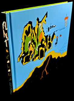
photo & text by nacrowe
to experience a MICHAEL DEFORGE graphic novel is to be submerged in a PHANTASMAGORIC VISION that plays within its own STRUCTURES and MECHANISMS and is visually a feast that has an INTERNAL LEXICON all its own. his graphic novel ANT COLONY (DRAWN AND QUARTERLY, 2014) is no disappointment on either front. he presents ARRESTING DEPICTIONS of GENOCIDAL VIOLENCE on a micro scale between an ANT COLONY and its local competition in PUGNACIOUS SPIDERS, AMORAL CENTIPEDES, UNAWARE HUMAN CHILDREN with magnified sunlight that is almost ZEUS-like in its arbitrary DESTRUCTIVE capacity and especially ULTRA-MILITANT RED ANTS. its a CONFRONTATIONAL VISION of life as a succession of THREATENING NEIGHBORS and the potential for WIDE-SCALE WANTON ANNIHILATION around every corner.
what is INTERESTING is how DEFORGE provides the ants with highly individualized and ANTHROPOMORPHIZED personalities with dreams and objectives, yet MYSTICAL outside forces such as pheromones ultimately govern their FATE. you cannot read this narrative and not come away with the fact that our lives are conducted under a similar thread of WIDESPREAD VIOLENCE and annihilation at the hands of a small number of politicians with access to nuclear codes and the like. all our physical and creative efforts at securing a future and providing for the next generation is just window dressing for a far more SEEDY and UNSTEADY REALPOLITIK that is churning just outside of our VISION that is constantly in TENSION and never not at play. the DEFORGE visuals are so BIZARRE and so EVOCATIVE that there is a certain VIOLENCE against our own senses of BEAUTY that is under attack when taking in and sussing out the narrative. id argue that the illustrations are so confrontationally VIVID that they effectively endear the story with a PALPABLE REALISM and AUTHENTICITY that is seemingly counterintuitive on paper. it should take you out of the narrative but it draws you further in. i very much feel it is quite an achievement that has MORAL IMPLICATIONS beyond one's sense of AESTHETICS. it makes that graphic novel have a sense of MORAL WEIGHT and GRAVITY, as if these warring tribes whose JARRING sense of INSATIABLE BLOODLUST is normal and justified by their very nature as SMALL INSECTS. the MORAL IMPLICATIONS to our own sense of justification around STATE VIOLENCE is STAGGERING and ultimately UNSETTLING. i cant wait to seek out more of his catalogue. i am intrigued by how DISCONCERTING the experience of reading ANT COLONY was for my personal sense of individuality. i want more! definitely worth checking out. 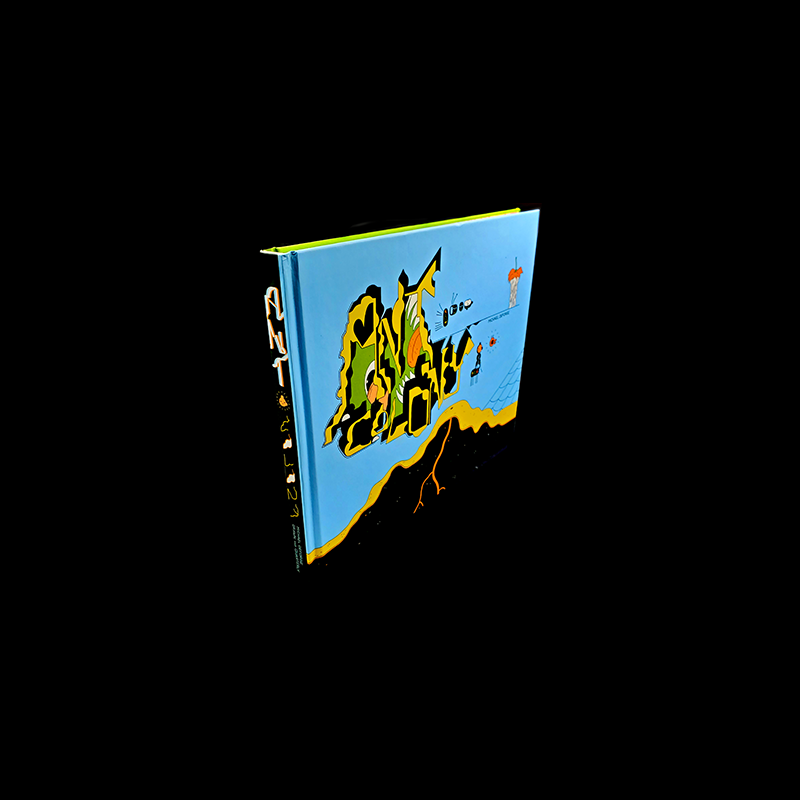
|

NICHOLAS ARCHIVES
July 2024
CATEGORIES
All
|